Archives

RIPTA Rider’s Guide

Completed in February 2020 as part of the Type + Image Graphic Design course with RISD:CE.

Brief: Create a set of instructions on how to complete a task with which you are familiar.

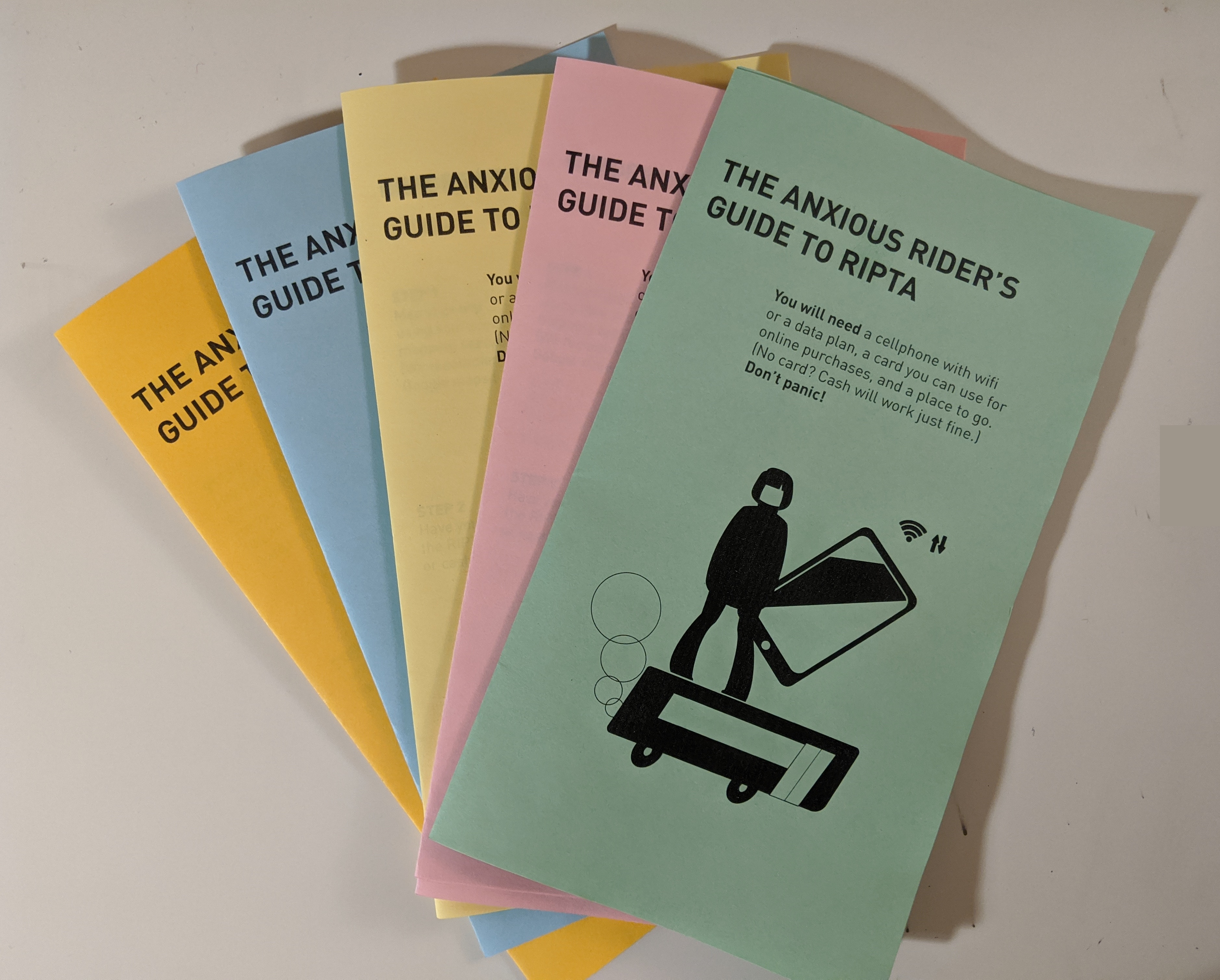
I chose to create a guide on how to ride the Rhode Island Public Transit Authority, after having a discussion with an acquaintance who was nervous about riding the bus.

The guide is set in DIN Pro, for its easy to read letter forms and its intended use in roadway and transit contexts. The pamphlet is printed on colored paper “zine” style as a way of being both friendly and cheap to produce, while harkening back to the days of the xerox zine, adding a hint of both nostalgia and a feeling of independence.

(Since the design and publication of this guide, RIPTA has updated their fare collection methods and thus this guide is no longer entirely accurate. It is also not in compliance with the restrictions and practices implemented as a result of the COVID-19 pandemic.)

This project was set up so that we first had to produce a set of instructions that was purely text and one which was done all in images. Digital renderings of my first two sets of instructions are below.

I drew my original inspiration from the RIPTA color scheme. We can also see the original, overwhelming image (p 3) I put together to attempt to explain the fare payment system (now defunct). Thankfully, the process has been greatly streamlined.

I deliberately set my text instructions in Comic Sans to fully embody the approachable and friendly tone (who could be threatened by Comic Sans?) I was trying to convey.

Postcards: Siken’s ‘Scheherazade’

Completed January 2020 as part of the Type + Image Graphic Design course with RISD:CE.

Brief: Using a poem as inspiration and as source material, design a set of postcards, along with a “container”.

I chose the poem “Scheherazade” by Richard Siken, from his 2005 collection Crush.

My intention was to create an experience which replicated the choices and the danger faced by the original Scheherazade, who wove stories to be left on an unresolved note each night to charm the king who had taken her as his wife to avoid being beheaded, with the pervasive sense of loss and grief which suffuses Siken’s poem.

My first step was to read the poem aloud several times making notes of where I added emphasis and where I would slow or stop to breathe. (EX: “How it was late [break] and no one could sleep [break]”)
I also took notes about how I described the original framing story of 1,001 Nights (“She spins them out” and “weaving a narrative”) to get inspiration for the materials I would use to construct my “container”.

I ultimately chose to lay out the poem across a series of “postcards” repeating the opening “Tell me…” as part of its own echo of the King’s injunction for Scheherazade to tell or continue telling her story(/stories).

The poem was type set in Garamond in the dimensions of an 8vo, to harken back to the type used in the first English translation of 1,001 Nights, published in London in the 18th c.


The final product was to be presented to the audience/user along with a knife.

What the poem and the King both fear is that something beautiful will be taken away from them. That if they can control the pace and the timing of the story, of their lives, then they can avoid being hurt by loss or change.

The only way to share any of these postcards with another person—the only way to send them through the mail—is by performing the butchery promised to Scheherazade; the person who wishes to send this card to another must slice the page out of the book to do so.

At one and the same time, the beautiful book-container becomes defaced, but also the individual card is unable to convey the full meaning of the poem, in its disarticulated state. Nothing can ever remain whole and unbroken and perfect. We must always make a choice.

Graphic Structure and Systems (RISD CE: Fall 2016)

Our first project had us attempting to convey nine concepts through the use of the most basic of graphic forms: points and lines. We did five iterations of the exercise; the first with a single point of any size, the second a single line of any length, the third with points of varying sizes, the fourth with lines of varying lengths, and the fifth (and final) being points of a single size.

The nine concepts we had to translate in this way were: density, distance, flux, light, noise, speed, transform, travel, and weight.

1.1 1.2 1.3 1.4 1.5

In our second project, we had to design posters with typographic elements on varying typographic systems. Some of them were to display the use of a single color, red.

grid system: colorgrid system: bwdilatational system: colorbilateral system: color,
axial system: color

Our third project was to demonstrate our understanding of gestalt principles in design. We had to choose an object and create designs using the gestalt principles of similarity, continuation, closure, proximity, and figure/ground. I chose the gear as my object. First, we put the principles into practice in two dimensions, using form, and then also color. We researched our objects to get an understanding of their history and development to ground our designs.

2D Gestalt Color Solutions2D Gestalt Solutions

Then we produced original packaging for our object based on a word of our choosing that we believed reflected the essential nature of our object. Mine was precision.

This slideshow requires JavaScript.

Feel free to examine my original die cut template and designs:

gearbox template + designs

The final project for the GS+S class was to produce a fully conceptualized book jacket for a book of our choosing. We were to design the cover by appropriating structure from a photograph. I produced a book jacket for Karl Marx’s Capital. I printed it at home, on my inkjet printer on brown craft paper, with the intention of having a product that had been created with my own means of production.

This slideshow requires JavaScript.