Grace Monk (Brown, Classics ’18) studied abroad in both Valparaíso, Chile and Athens, Greece during her undergraduate career. Her senior thesis, in Comparative Literature, examined the social, political, and economic situations in those two countries and the ways in which they have shaped and influenced street art in both countries. As part of her final presentation, she invited three artists, two from Chile and one from Greece, to speak about their careers and influences. The lecture took place on April 9, 2018, at the Joukowsky Forum at the Watson Institute at Brown University. It was presented in both Spanish and Greek, with simultaneous translation provided for the audience. In addition, Greek artist Simek produced a temporary installation in the Watson Institute lobby, and all three artists produced works in a public demonstration on the lawn of the Marty and Perry Granoff Center over the course of two days. On April 13, 2018, the final products were put on display at the Cogut Institute for the Humanities, at 172 Meeting St, in Providence, RI.
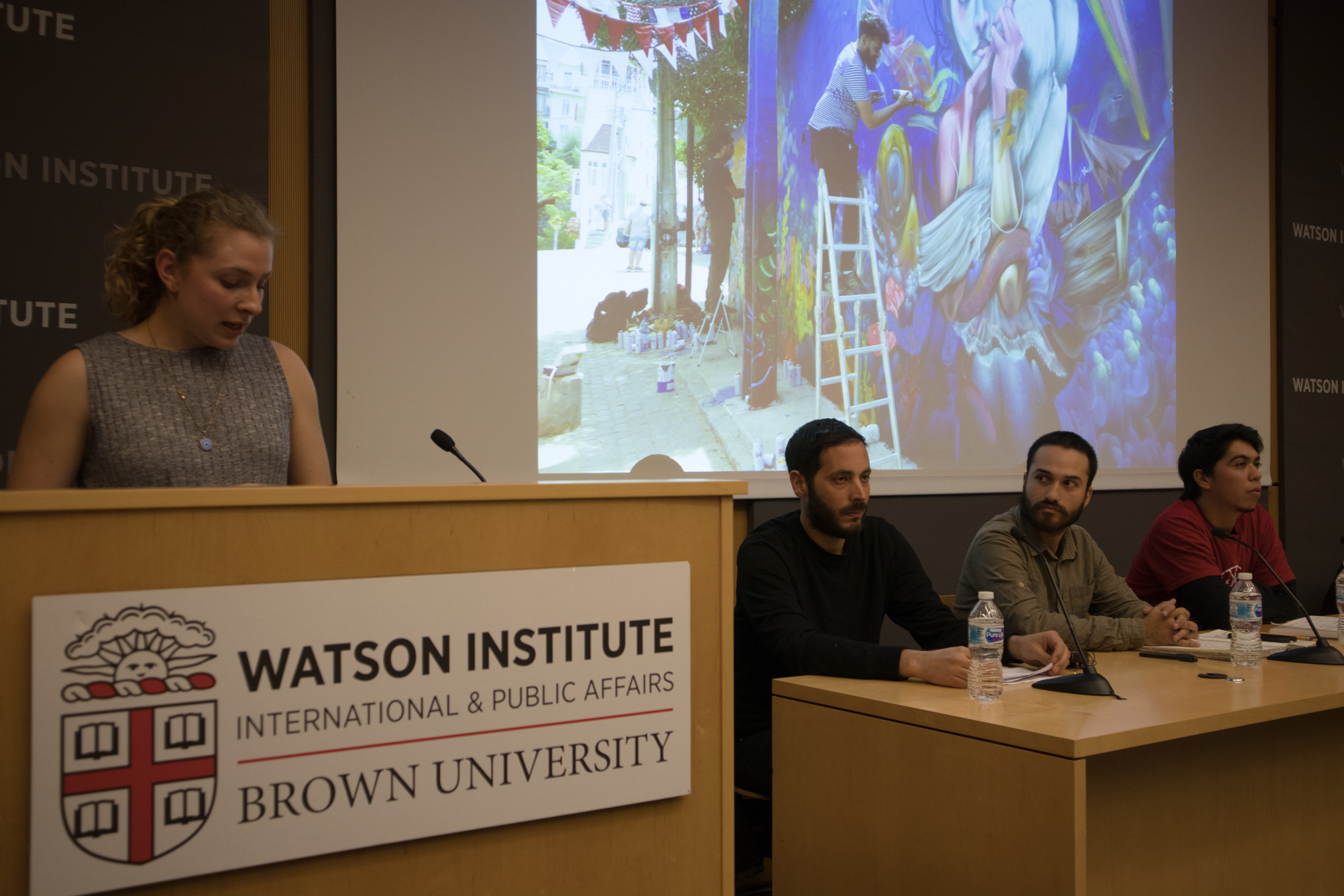
Grace Monk introduces street artists (L to R) Simek, from Greece, Francisco Verdugo Navea and Juan Lara Hidalgo, from Chile.
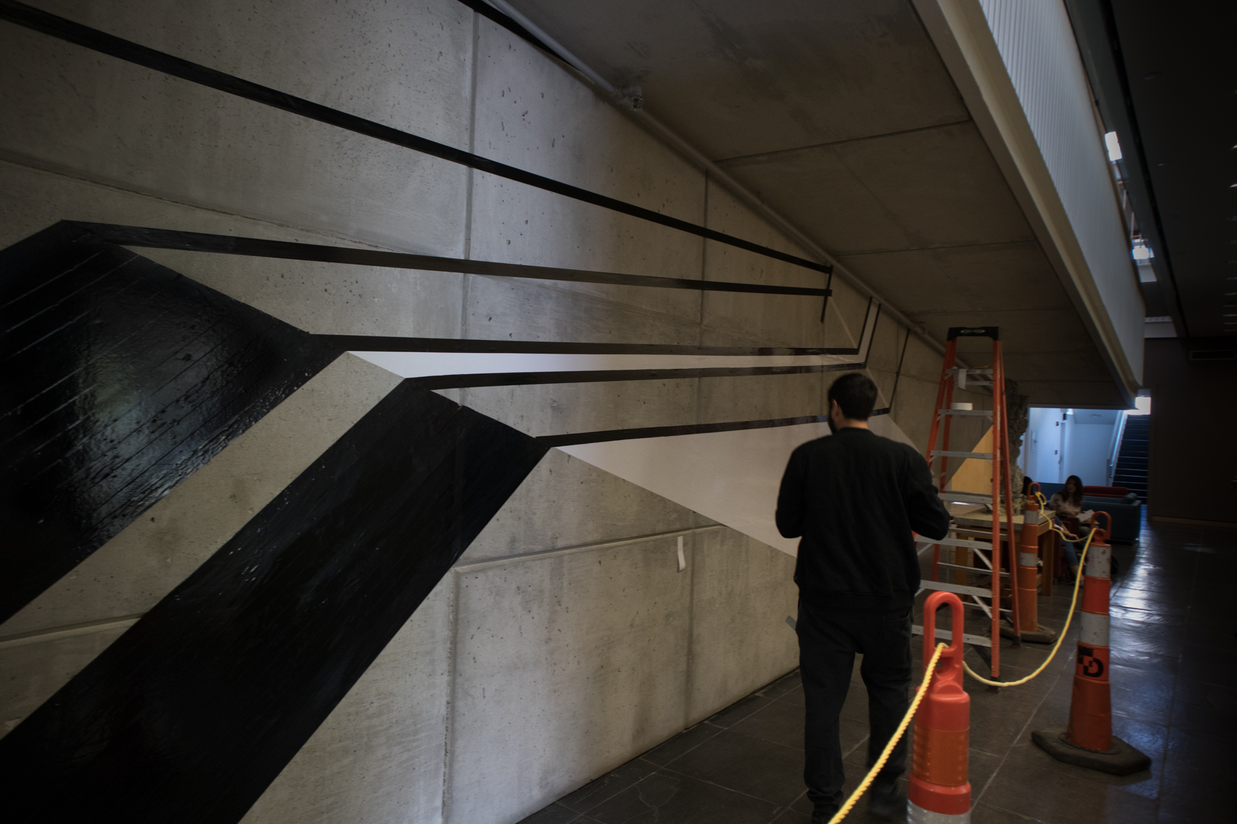
Greek artist Simek puts together an installation on the ground floor of the Watson Institute at Brown University.
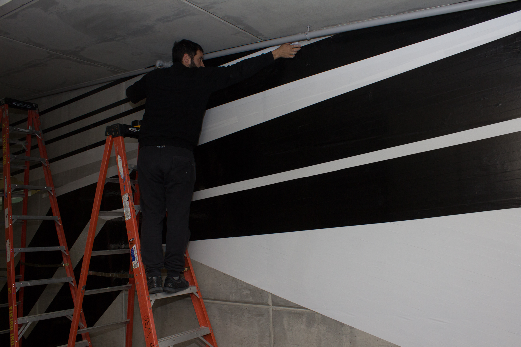
Though Simek usually works with paint, the temporary exhibit of his work in the Watson Institute was produced with colored duct tape.

Simek’s installation stretched across the wall and up and around the staircase.
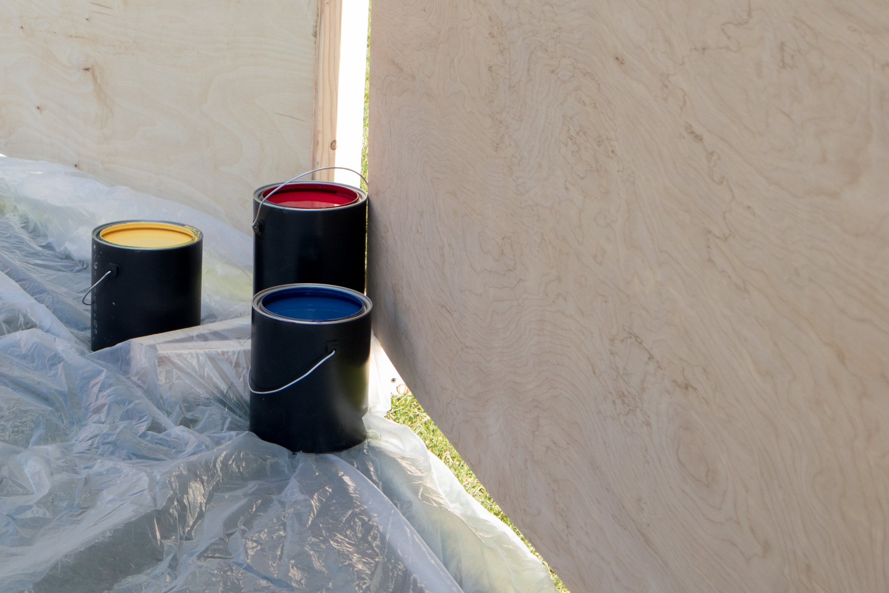
Chilean street artists FRANK and JuanTag mixed most of their colors from scratch using white and black in addition to the three primary colors.
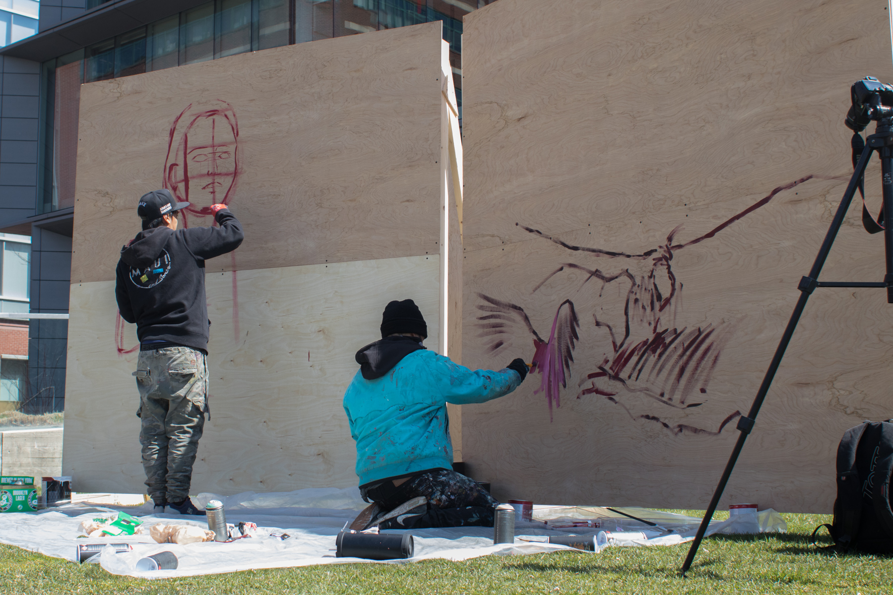
FRANK and Juantag start the public demonstration of their process on the lawn of the Granoff Center at Brown University.
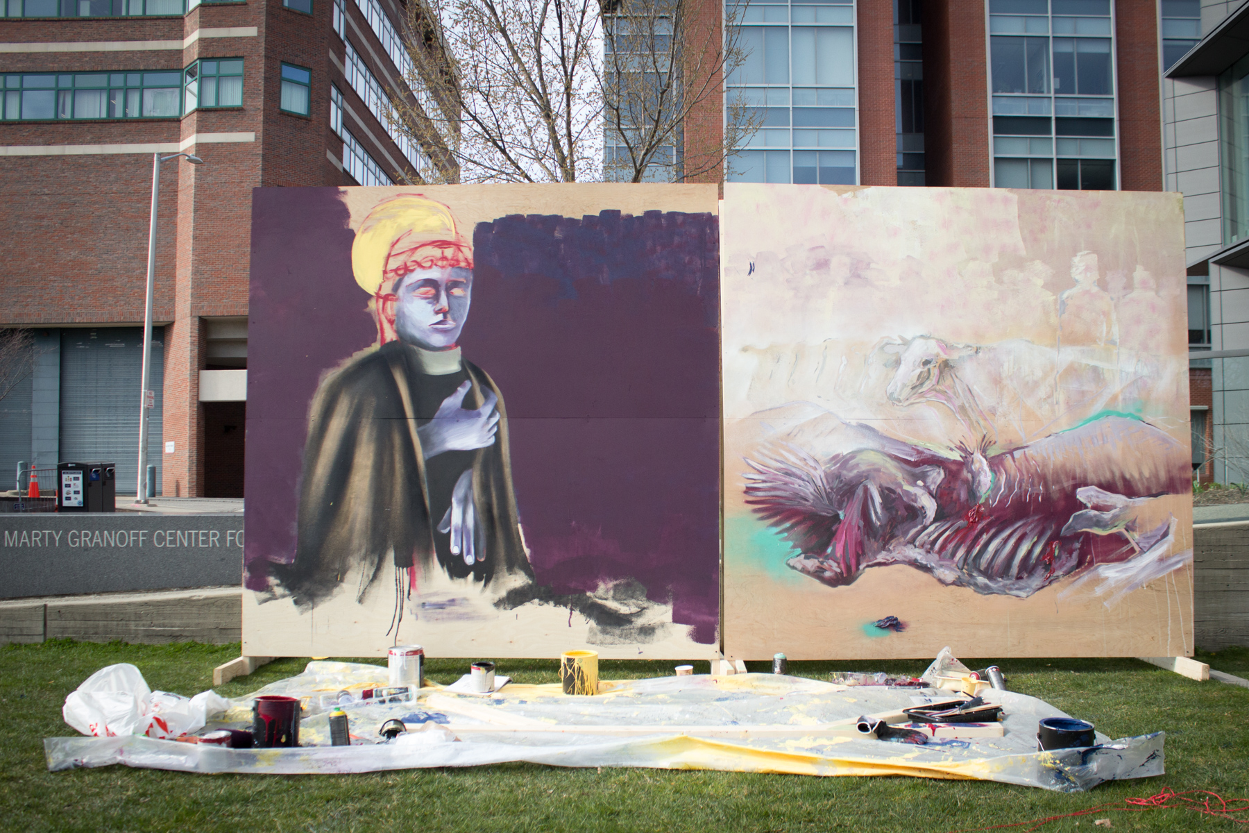
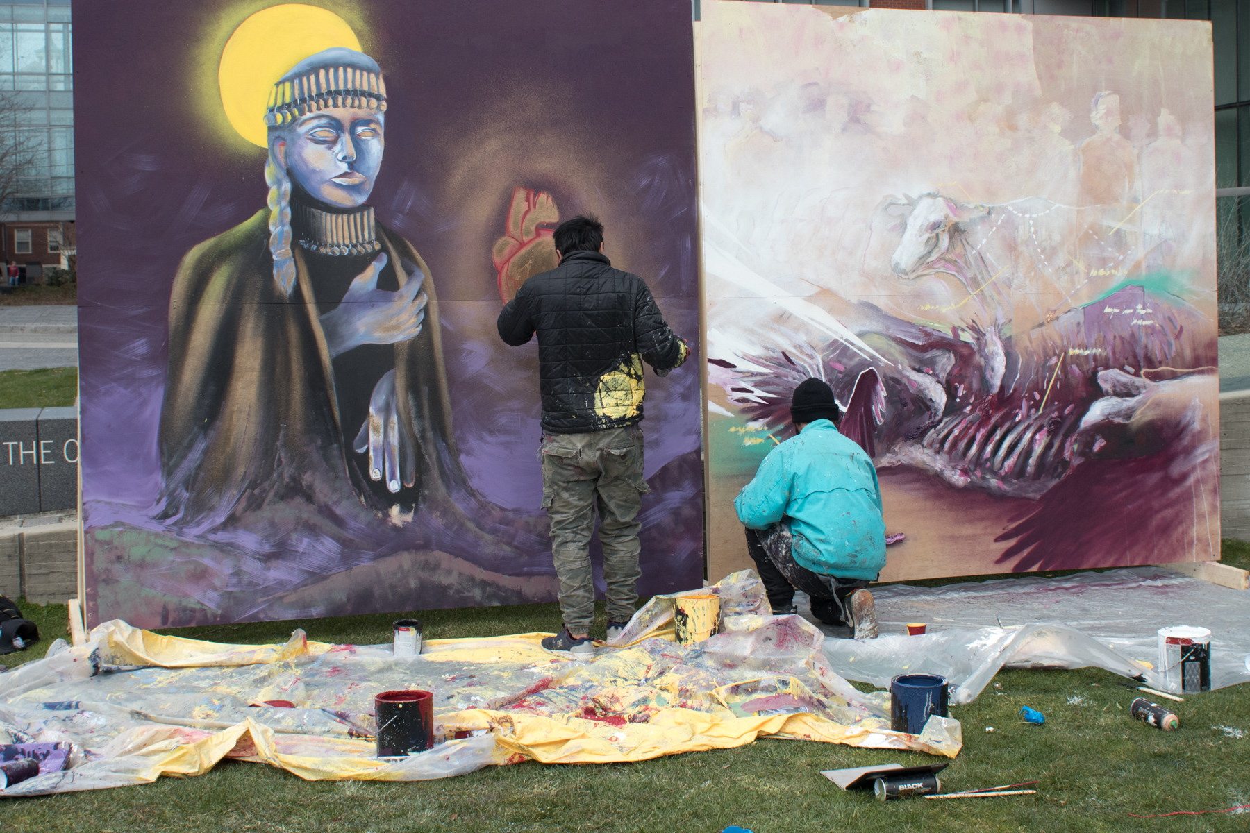
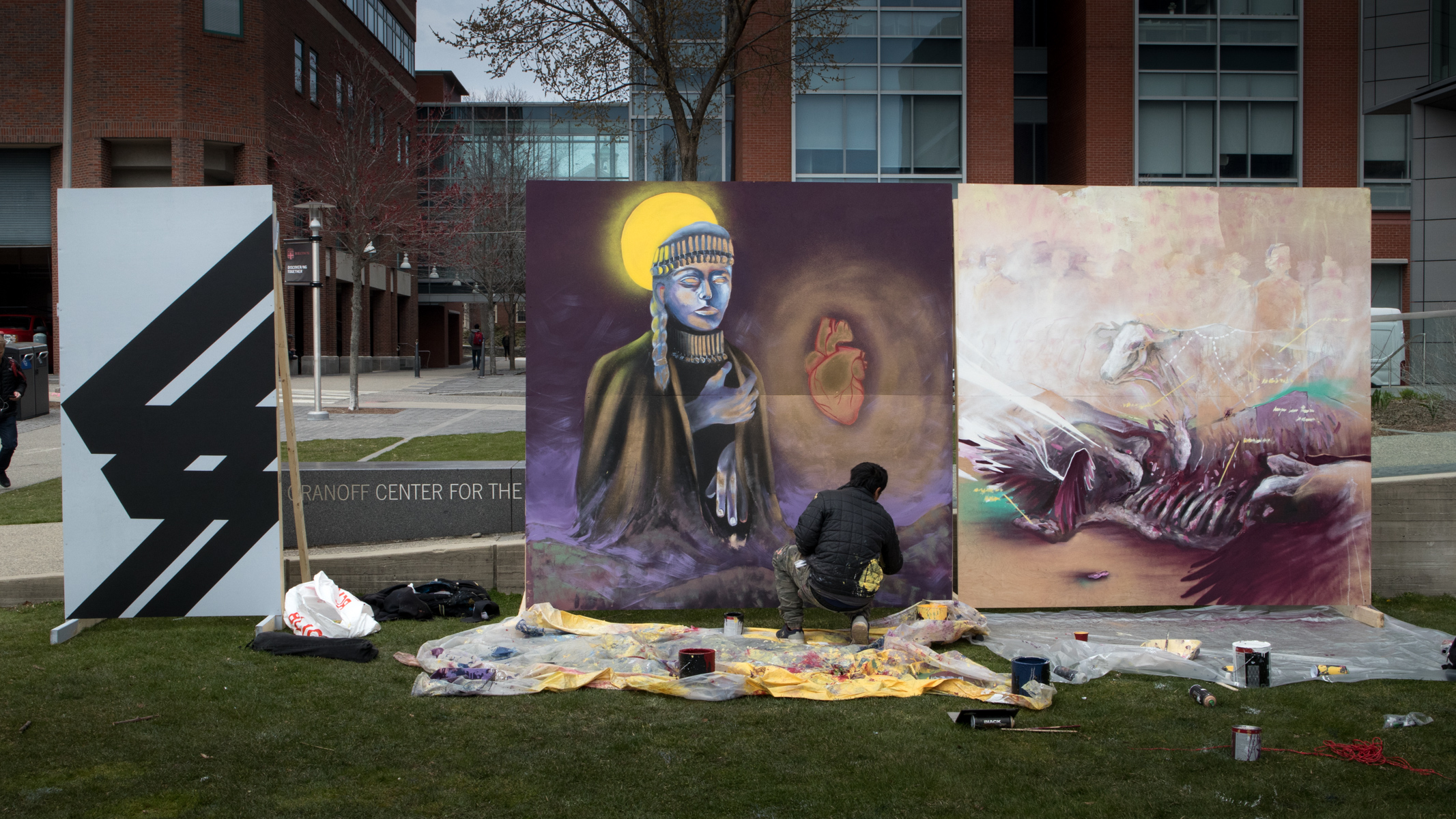
JuanTag’s piece sought to memorialize the indigenous experience, drawing on Catholic religious imagery. FRANK’s piece focussed on the plight of Chilean farmers who have been left at the mercy of big agri-businesses due to decisions made by the Chilean government.
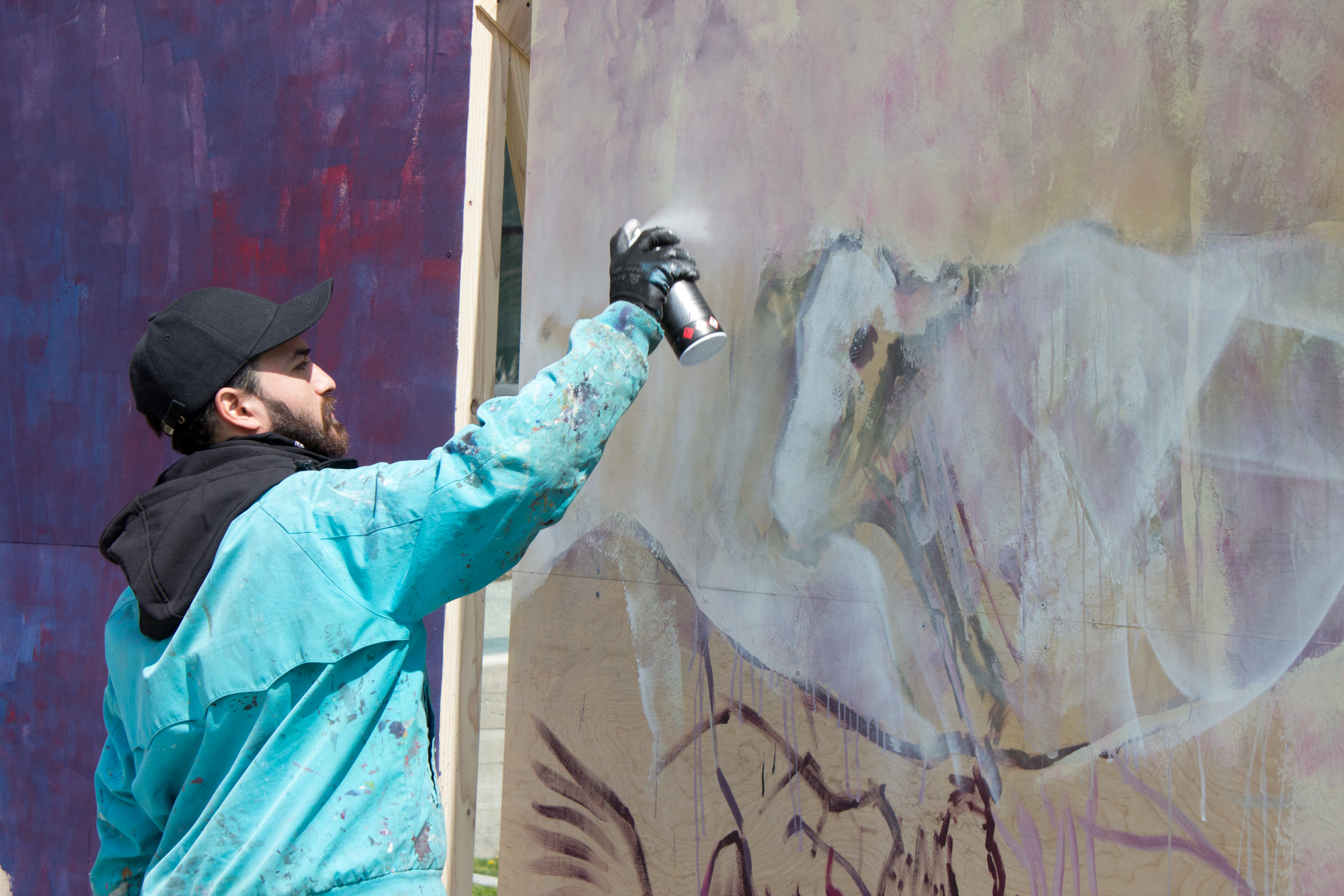
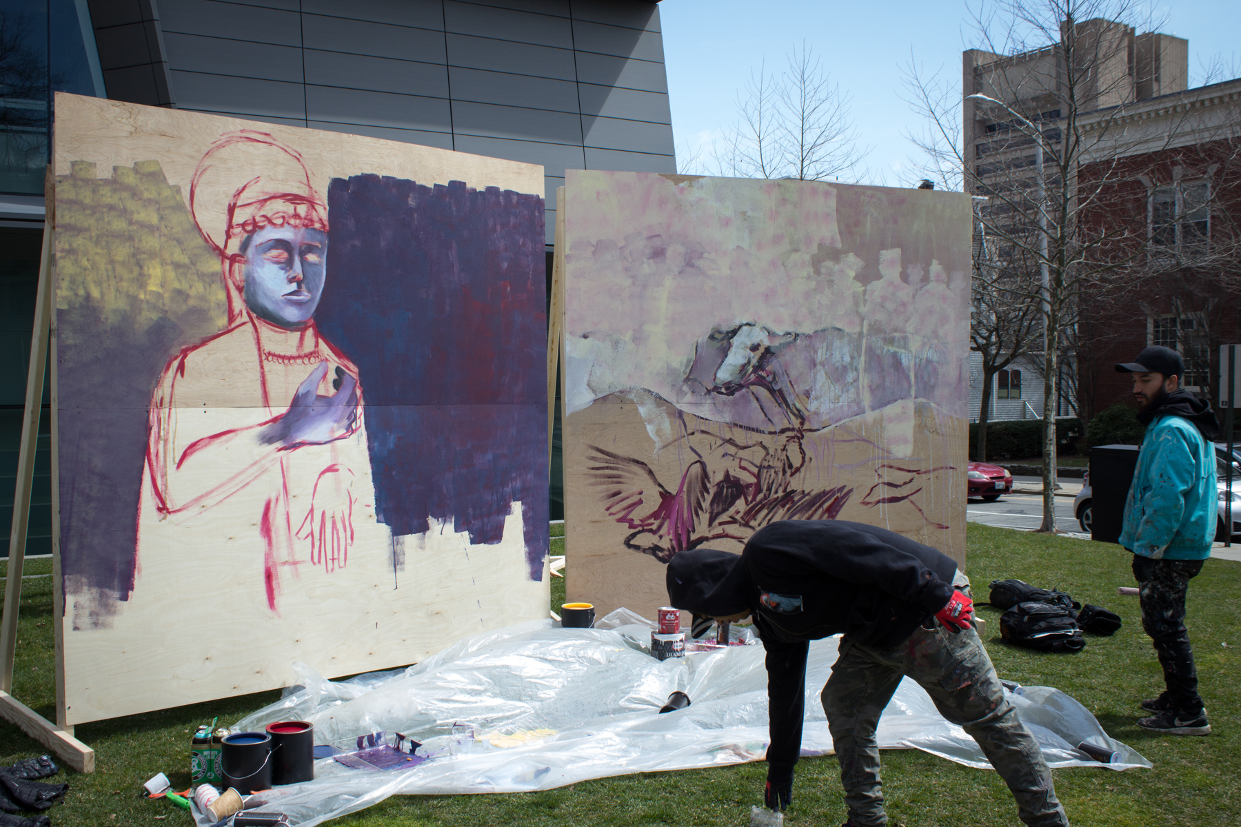
In addition to traditional painting materials, FRANK (pictured) and JuanTag also incorporated materials more commonly associated with graffiti and street art, such as spray paint cans.
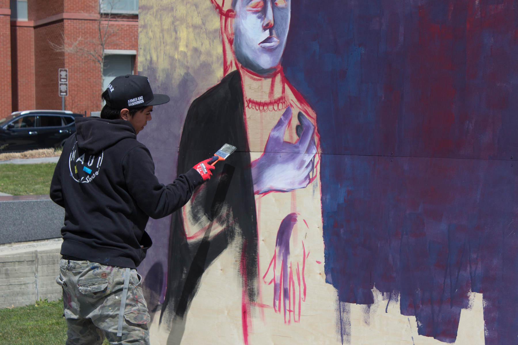
JuanTag (pictured) and FRANK both study at La Escuela Municipal de Bellas Artes de Valparaíso in Chile.
Despite needing to contend with chilly temperatures and disruptive gusts of wind, the demonstration pieces start to take on form.
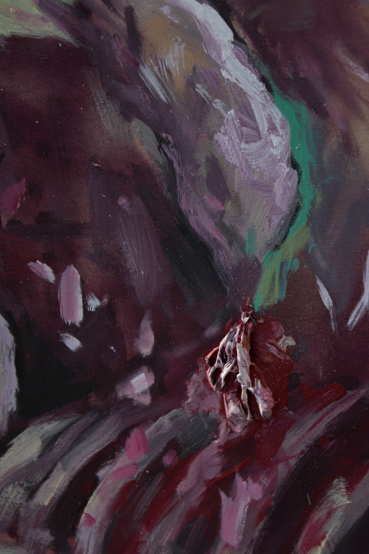
FRANK uses the film that forms on the tops of the open paint vessels to create a 3D texture.
JuanTag (left) and FRANK (right) move into the final stages of their respective art pieces.
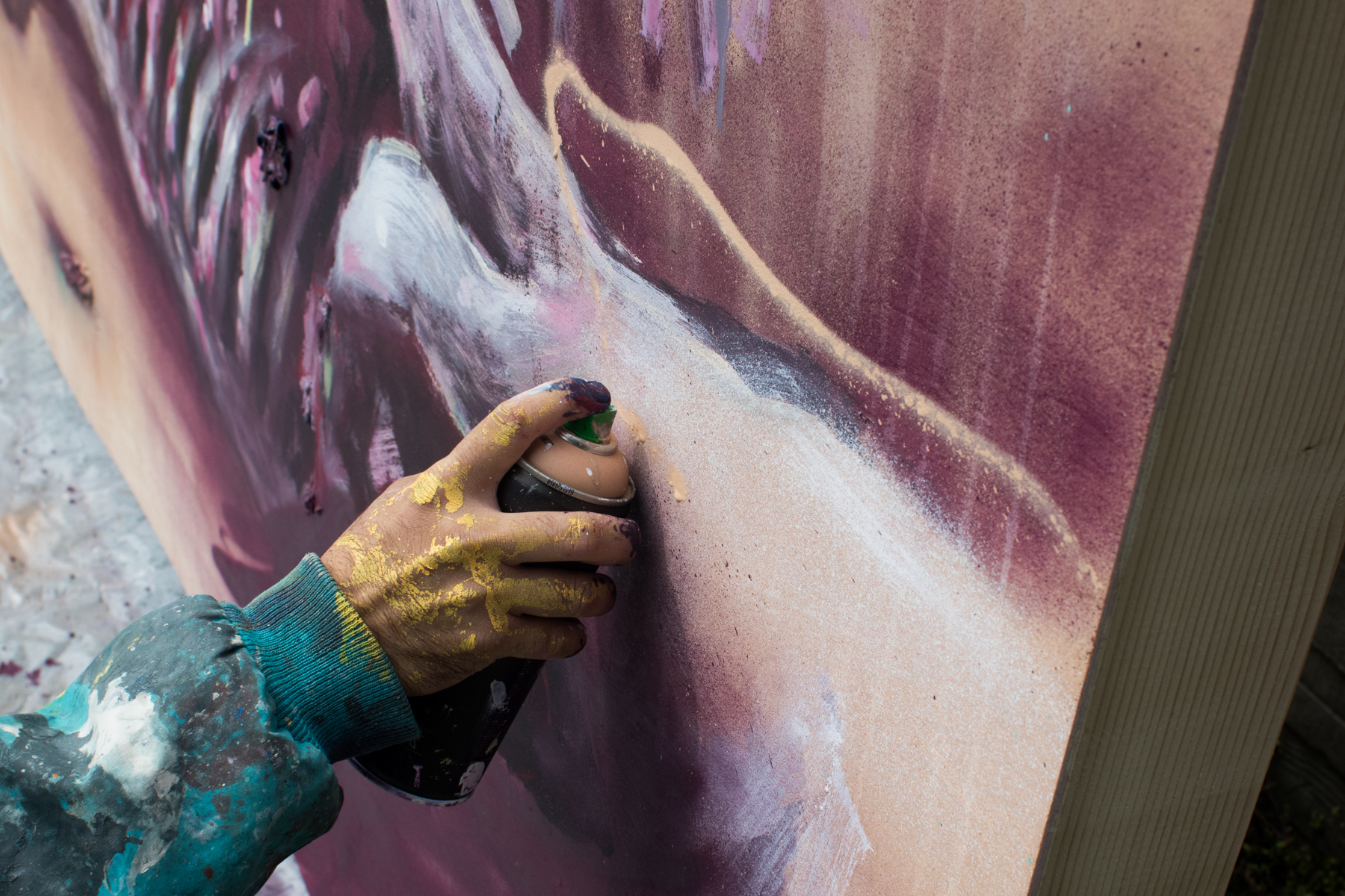
In addition to traditional painting materials, FRANK (pictured) and JuanTag also incorporated materials more commonly associated with graffiti and street art, such as spray paint cans.
While Simek debates adding to his piece, JuanTag works on his own finishing touches.
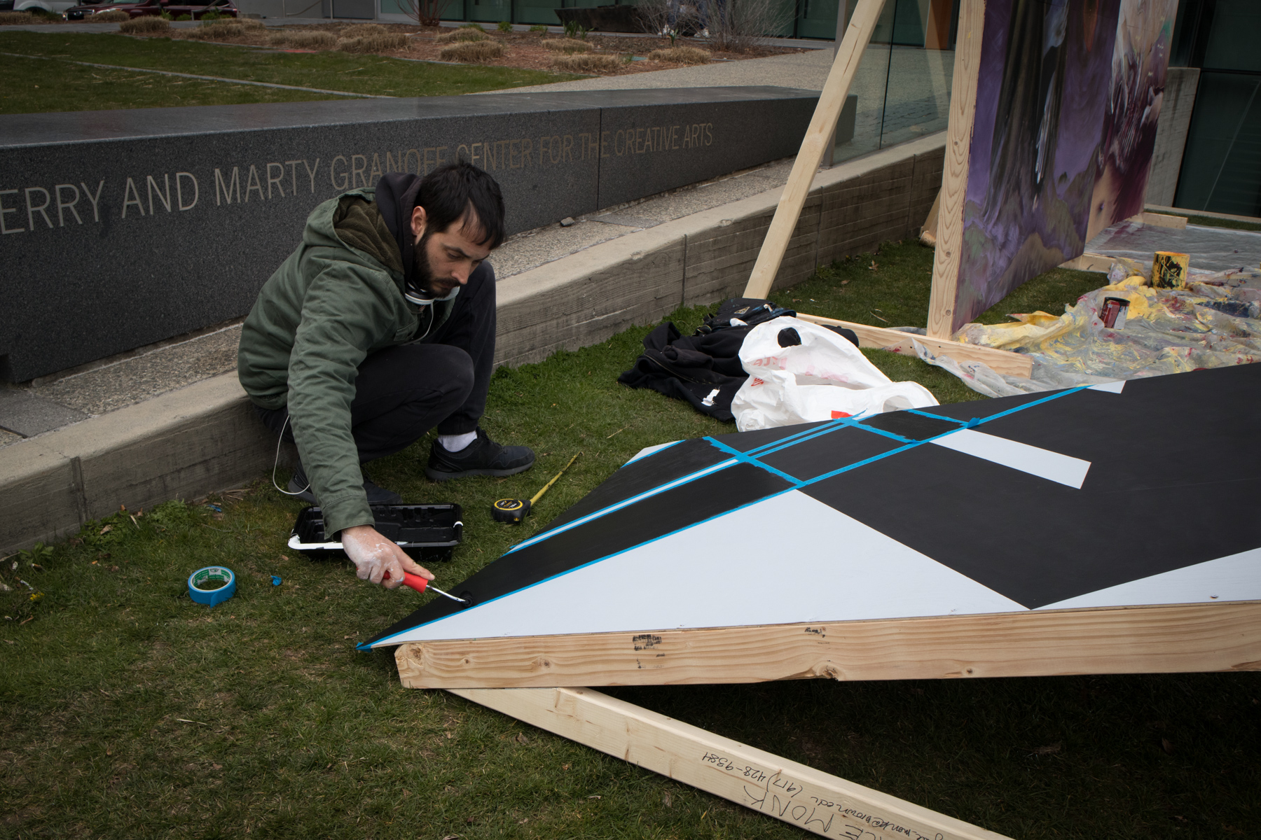
In addition to the installation at the Watson, Simek also painted one of his geometric designs to be displayed alongside the work done by JuanTag and FRANK.
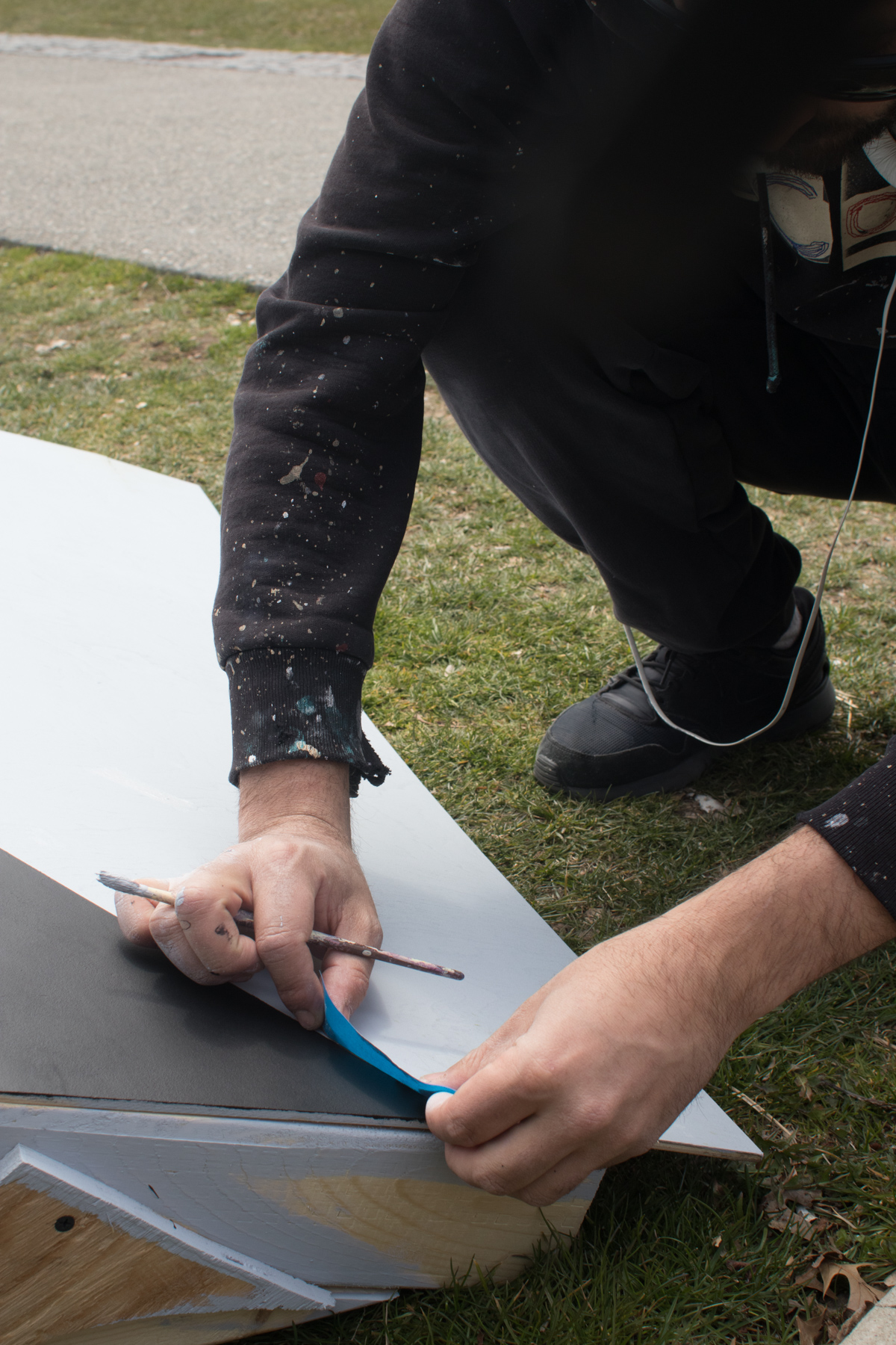
Simek uses masking tape to ensure the edges of his lines are exactly right.
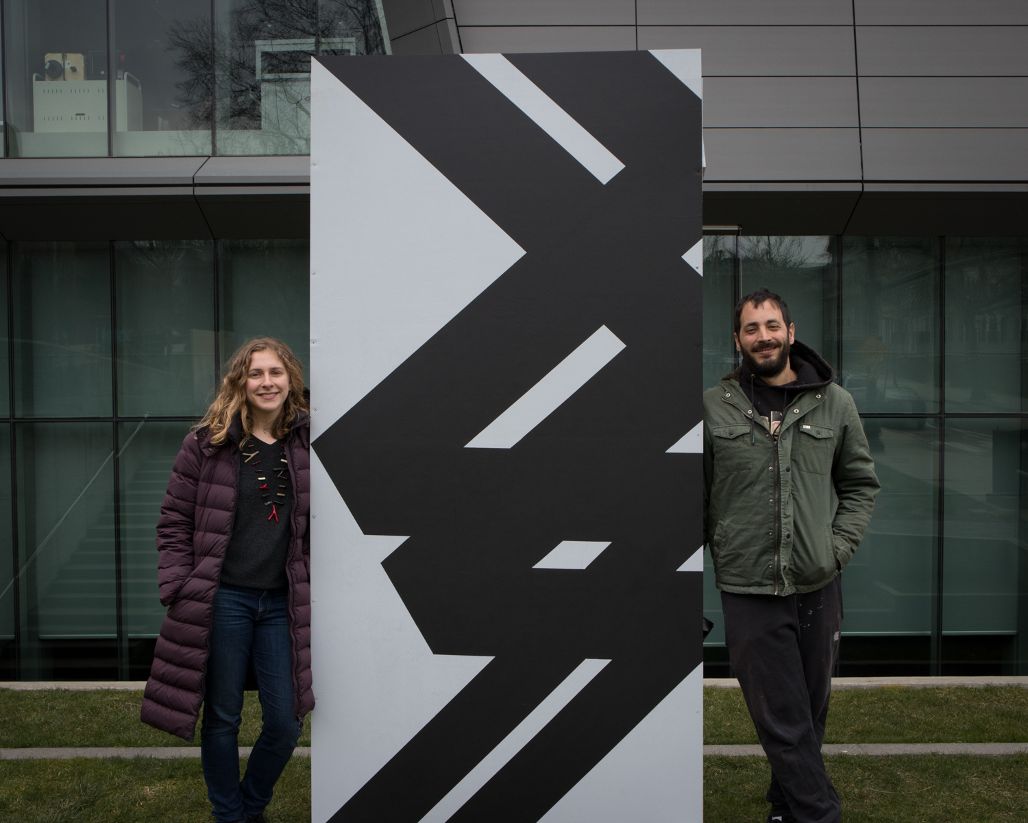
Grace Monk and Simek show off Simek’s finished piece in front of the Granoff Center.
To learn more about FRANK you can find him on instagram under the handle @frankverdugo_, Simek can be found on Facebook, and JuanTag has posted some of his work to Flickr.